Minimalist IAS
CSAT

CSAT · 58 questions

Data interpretation & sufficiency

Every UPSC CSAT question on this topic, 2016–2026, newest first. Tap an option to check yourself; the answer and explanation open below it.

Data interpretation & sufficiency questions per year: 2016: 0, 2017: 1, 2018: 13, 2019: 0, 2020: 6, 2021: 5, 2022: 7, 2023: 5, 2024: 10, 2025: 5, 2026: 6 Asked in 9 of 11 years · most in 2018 (13)

UPSC syllabus: “Basic numeracy (numbers and their relations, orders of magnitude, etc.) (Class X level), Data interpretation (charts, graphs, tables, data sufficiency etc. — Class X level);” See the full syllabus →

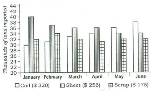
Directions for the following 3 (three) items: The following three items are based on the graph given below which shows imports of three different types of steel over a period of six months of a year. Study the graph and answer the three items that follow.

The figures in the brackets indicate the average cost per ton over six months period.

MonthCoil ($ 320)Sheet ($ 256)Scrap ($ 175)
January304032
February313734
March333632
April343631
May363432
June383432
Bar chart of steel imports (thousands of tons, axis 20 to 44) for January to June, with bars for coil, sheet and scrap each month; the table gives the bar heights read from the chart.
From UPSC's question paper.

By how much (measured in thousands of tons) did the import of sheet steel exceed the import of coil steel in the first three months of the year?

Answer & explanation

Answer: (c) 19

Add the January–March bars: sheet 40 + 37 + 36 = 113 and coil 30 + 31 + 33 = 94 thousand tons. Sheet exceeds coil by 19 thousand tons.

  1. Sheet, January–March: 40 + 37 + 36 = 113 thousand tons.
  2. Coil, January–March: 30 + 31 + 33 = 94 thousand tons.
  3. Excess = 113 − 94 = 19.
  4. Check month by month: 10 + 6 + 3 = 19.

Remember · For a total difference over several months, add the month-by-month gaps; it is quicker and cross-checks the totals.

Question and answer: UPSC's official GS Paper II (2018, Series A) — paper ↗ · answer key ↗. Explanation: Minimalist IAS, checked 1 Oct 2026 (how we verify). Permalink ·
Directions for the following 3 (three) items: The following three items are based on the graph given below which shows imports of three different types of steel over a period of six months of a year. Study the graph and answer the three items that follow.

The figures in the brackets indicate the average cost per ton over six months period.

MonthCoil ($ 320)Sheet ($ 256)Scrap ($ 175)
January304032
February313734
March333632
April343631
May363432
June383432

Uses the same figure as Q11 ↑

What was the approximate total value (in $) of sheet steel imported over the six months period?

Answer & explanation

Answer: (c) 55,550

Sheet imports over the six months total 217 thousand tons; at the average $256 a ton that is 55,552 — nearest to 55,550. Because the tonnage is in thousands, the value is in thousands of dollars too.

  1. Sheet imports: 40 + 37 + 36 + 36 + 34 + 34 = 217 thousand tons.
  2. Value = 217 × 256 = 55,552 (thousand $), using the average cost of $256 per ton.
  3. Nearest option: 55,550.
  4. Check: 217 × 256 is close to 220 × 250 = 55,000, which rules out 45,555, 50,555 and 65,750.

Remember · Total value = total quantity × average price; keep the units (here thousands) in mind and round to eliminate far-off options.

Question and answer: UPSC's official GS Paper II (2018, Series A) — paper ↗ · answer key ↗. Explanation: Minimalist IAS, checked 1 Oct 2026 (how we verify). Permalink ·
Directions for the following 3 (three) items: The following three items are based on the graph given below which shows imports of three different types of steel over a period of six months of a year. Study the graph and answer the three items that follow.

The figures in the brackets indicate the average cost per ton over six months period.

MonthCoil ($ 320)Sheet ($ 256)Scrap ($ 175)
January304032
February313734
March333632
April343631
May363432
June383432

Uses the same figure as Q11 ↑

What was the approximate ratio of sheet steel and scrap steel imports in the first three months of the year?

Answer & explanation

Answer: (b) 1.2: 1

In January–March, sheet imports total 113 and scrap imports 32 + 34 + 32 = 98 thousand tons. 113 ÷ 98 is about 1.15, which is closest to 1.2 : 1.

  1. Sheet, January–March: 40 + 37 + 36 = 113.
  2. Scrap, January–March: 32 + 34 + 32 = 98.
  3. 113 ÷ 98 ≈ 1.15, so the ratio is about 1.2 : 1.
  4. Check: 1.4 : 1 would need sheet near 137, and 1 : 1 would need equal totals — neither fits.

Remember · For an approximate ratio, divide the two totals once and choose the nearest option.

Question and answer: UPSC's official GS Paper II (2018, Series A) — paper ↗ · answer key ↗. Explanation: Minimalist IAS, checked 1 Oct 2026 (how we verify). Permalink ·
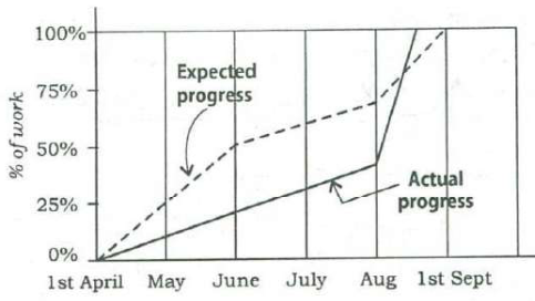
Consider the following graph:

Line graph of % of work (0–100%) from 1st April to 1st September. The dashed ‘Expected progress’ line reaches about 25% by May, 50% by June, about 70% by August and 100% on 1st September; the solid ‘Actual progress’ line rises slowly to about 42% by August, then climbs steeply, crosses above the expected line and reaches 100% before 1st September.
From UPSC's question paper.

Which one of the following statements is not correct with reference to the graph given above?

Answer & explanation

Answer: (d) During the period from 1st April to 1st September, at no time was the actual progress more than the expected progress.

In August the actual-progress line shoots up, crosses above the expected line and reaches 100% before 1st September. So for a while actual progress did exceed expected progress, which makes statement (d) the incorrect one.

  1. (a) On 1st June actual progress is about 22% against an expected 50% — true.
  2. (b) The actual line is steepest in August, rising from about 42% to 100% — true.
  3. (c) Actual progress reaches 100% during August, before the expected finish on 1st September — true.
  4. (d) In late August the actual line crosses above the expected line, so actual progress was more than expected for a time — false.
  5. The statement that is not correct is (d).

Remember · In 'not correct' graph items, test every option against the picture, and look closely where two lines cross.

Question and answer: UPSC's official GS Paper II (2018, Series A) — paper ↗ · answer key ↗. Explanation: Minimalist IAS, checked 1 Oct 2026 (how we verify). Permalink ·
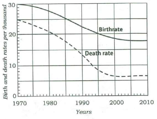
Directions for the following 2 (two) items: Consider the following graph in which the birthrate and death rate of a country are given, and answer the two items that follow.

Line graph, 1970–2010, of birth and death rates per thousand: the birthrate (solid) falls from 30 to about 22.5 in 1990 and 19 in 2000, then levels off at about 18; the death rate (dashed) falls from 25 to about 14 in 1990 and about 6.5 by 2000, then stays near 6.5–7.
From UPSC's question paper.

Looking at the graph, it can be inferred that from 1990 to 2010

Answer & explanation

Answer: (d) population growth rate shows no trend

Why not the tempting option · UPSC's key is (d). The gap between the two curves, which is the growth rate, widens from about 8.5 per thousand in 1990 to about 11.5 in 2000, then flattens and eases slightly to about 11 by 2010, so there is no single direction across 1990–2010. 'Has increased' is tempting because 2010 sits higher than 1990, but the rise ends at 2000 and the gap drifts down after that. In the exam, read a trend over a stated period as one consistent direction across the whole period, as UPSC does; its key to the next item likewise treats the growth rate as having stabilised after 2005.

The population growth rate is the gap between the birthrate and the death rate. From 1990 the gap widens, from about 8.5 to about 11.5 per thousand by 2000, and then flattens and eases slightly to about 11 by 2010. A rise followed by a plateau is not a single direction, so over 1990–2010 the growth rate shows no trend: (d).

  1. Natural growth rate = birthrate − death rate: the vertical gap between the two curves.
  2. 1990: about 22.5 − 14 = 8.5 per thousand. 1995: about 20 − 9.5 = 10.5.
  3. 2000: about 18.5 − 7 = 11.5. 2005: about 18 − 6.5 = 11.5. 2010: about 18 − 7 = 11.
  4. So the gap rises through the 1990s, then stops rising and dips a little through the 2000s.
  5. 'Increased' needs the rise to run through the whole period, but it ends at 2000; 'decreased' and 'stable' fail for the 1990s. A rise that then levels off is no single trend: (d).

Remember · Population growth rate = birth rate − death rate: read the gap between the curves, not the curves themselves. A rise that then levels off is 'no trend' over the whole period, not 'increased'.

Question and answer: UPSC's official GS Paper II (2018, Series A) — paper ↗ · answer key ↗. Explanation: Minimalist IAS, checked 1 Oct 2026 (how we verify). Permalink ·
Directions for the following 2 (two) items: Consider the following graph in which the birthrate and death rate of a country are given, and answer the two items that follow.

With reference to the above graph, consider the following statements considering 1970 as base year:

  1. 1.Population has stabilized after 35 years.
  2. 2.Population growth rate has stabilized after 35 years.
  3. 3.Death rate has fallen by 10% in the first 10 years.
  4. 4.Birthrate has stabilized after 35 years.

Uses the same figure as Q63 ↑

Which of the above are the most logical and rational statements that can be made from the above graph?

Answer & explanation

Answer: (d) 2 and 4

From 2005 (35 years after 1970) both curves flatten — the birthrate near 18 and the death rate near 6.5–7 — so the birthrate and the growth rate (their gap) have stabilised. The population itself keeps growing, and the death rate fell by much more than 10% in 1970–80.

  1. 35 years after 1970 is 2005; compare the curves from 2005 to 2010.
  2. Birthrate: about 18 throughout; death rate: about 6.5 to 7; gap about 11 throughout.
  3. 1970–80: death rate from 25 to about 21, a fall of about 16%.
  • ✗ 1. Births stay well above deaths after 2005, so the population keeps growing; only its growth rate is steady.
  • ✓ 2. After 2005 the gap between the curves stays at about 11 per thousand, so the growth rate has stabilised.
  • ✗ 3. The death rate falls from 25 to about 21 per thousand in 1970–80, about 16% (4 points), not 10%.
  • ✓ 4. The birthrate curve runs flat at about 18 per thousand from 2005 to 2010.

Remember · A steady growth rate is not a steady population; population stops growing only when births equal deaths.

Question and answer: UPSC's official GS Paper II (2018, Series A) — paper ↗ · answer key ↗. Explanation: Minimalist IAS, checked 1 Oct 2026 (how we verify). Permalink ·
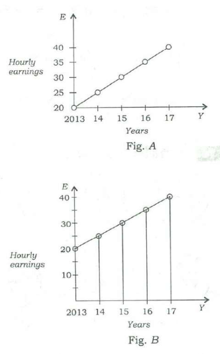
Average hourly earnings per year (E) of the workers in a firm are represented in figures A and B as follows:

Year20132014201520162017
E in Fig. A2025303540
E in Fig. B2025303540
Two line graphs of hourly earnings E for 2013–2017. Fig. A's vertical axis starts at 20 and is marked every 5; Fig. B's starts near 0 and is marked every 10. Both plot E = 20, 25, 30, 35 and 40, so the lines look different only because the scales differ.
From UPSC's question paper.

From the figures, it is observed that the

Answer & explanation

Answer: (c) slopes of the graphs are same

Both figures plot the same data: E rises from 20 to 40 by 5 each year. Only the axis scales differ, making one line look steeper; the actual slope — 5 per year — is the same in both.

  1. Fig. A: E = 20, 25, 30, 35, 40 for 2013–17; Fig. B shows the same points on a differently scaled axis.
  2. (a) The values are identical — false.
  3. (b) The range is 40 − 20 = 20 in both — false.
  4. (d) E rises by 5 a year in both — false.
  5. (c) Slope = change in E per year = 5 in both — true; the visual difference comes only from the scale.

Remember · Before comparing graphs, read the axis scales; stretching an axis changes how steep a line looks, not the data.

Question and answer: UPSC's official GS Paper II (2018, Series A) — paper ↗ · answer key ↗. Explanation: Minimalist IAS, checked 1 Oct 2026 (how we verify). Permalink ·
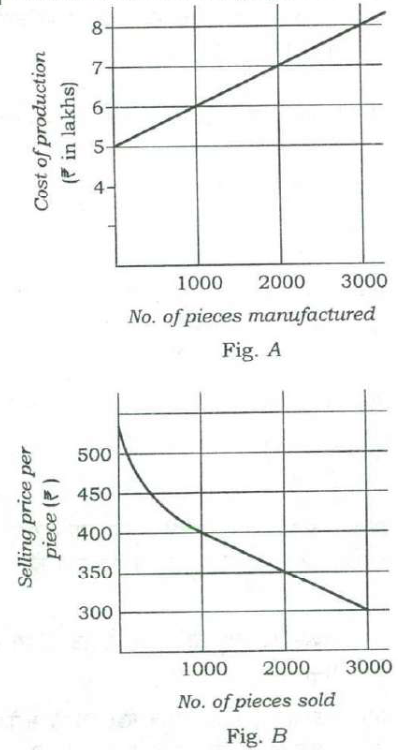
Consider the following figures A and B:

No. of piecesCost of production (₹ in lakhs), Fig. ASelling price per piece (₹), Fig. B
10006400
20007350
30008300
Fig. A: cost of production (₹ lakh) rises in a straight line from 5 at zero to 6, 7 and 8 at 1000, 2000 and 3000 pieces. Fig. B: selling price per piece falls along a curve from above ₹500 to ₹400 at 1000 pieces sold, then in a straight line to ₹350 at 2000 and ₹300 at 3000.
From UPSC's question paper.

The manufacturing cost and projected sales for a product are shown in the above figures A and B respectively. What is the minimum number of pieces that should be manufactured to avoid a loss?

Answer & explanation

Answer: (a) 2000

Revenue is pieces × price. At 1000 pieces it is ₹4 lakh against a cost of ₹6 lakh; at 2000 pieces it is 2000 × ₹350 = ₹7 lakh, exactly the cost. So 2000 pieces is the minimum that avoids a loss.

  1. 1000 pieces: revenue 1000 × 400 = ₹4 lakh; cost ₹6 lakh — a loss of ₹2 lakh.
  2. 1500 pieces: price about ₹375, revenue about ₹5.6 lakh; cost ₹6.5 lakh — still a loss.
  3. 2000 pieces: revenue 2000 × 350 = ₹7 lakh; cost ₹7 lakh — no loss (break-even).
  4. 3000 pieces: revenue 3000 × 300 = ₹9 lakh against ₹8 lakh — a profit, but 2000 already suffices.
  5. Minimum number to avoid a loss: 2000.

Remember · Break-even: compare revenue (quantity × price) with cost at each point; the first point where revenue reaches cost is the answer.

Question and answer: UPSC's official GS Paper II (2018, Series A) — paper ↗ · answer key ↗. Explanation: Minimalist IAS, checked 1 Oct 2026 (how we verify). Permalink ·

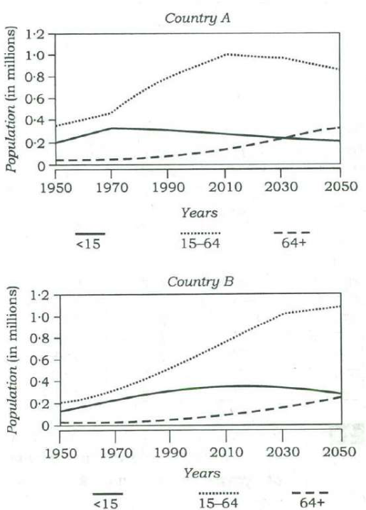
Consider the following graphs. The curves in the graphs indicate different age groups in the populations of two countries A and B over a period of few decades:

With reference to the above graphs, which of the following are the most logical and rational inferences that can be made?

  1. 1.Over the last two and a half decades, the dependency ratio for country B has decreased.
  2. 2.By the end of next two and a half decades, the dependency ratio of country A will be much less than that of country B.
  3. 3.In the next two decades, the work-force relative to its total population will increase in country B as compared to country A.
Two line graphs, 1950–2050, of population (in millions) by age group (<15, 15–64, 64+). Country A: 15–64 rises to about 1.0 by 2010 and falls to about 0.87 by 2050; <15 drifts down from about 0.33 to 0.22; 64+ climbs past the <15 line around 2030 to about 0.34. Country B: 15–64 keeps rising to about 1.1 by 2050; <15 stays around 0.3–0.36; 64+ rises slowly to about 0.26.
From UPSC's question paper.

Select the correct answer using the code given below.

Answer & explanation

Answer: (c) 1 and 3 only

Dependency ratio = (under-15 + over-64) ÷ working-age (15–64). In B the working-age group grew much faster than the dependants over the past 25 years, so the ratio fell (1). Ahead, A's working-age group shrinks while its elderly grow, so A's ratio will not be much lower than B's (2 fails), and B's working-age share rises while A's falls (3).

  1. Dependency ratio = (<15 + 64+) ÷ (15–64).
  2. Country B, about 1990: (0.32 + 0.05) ÷ 0.54 ≈ 0.69; about 2015: (0.36 + 0.11) ÷ 0.84 ≈ 0.56 — decreased.
  3. Around 2043: A ≈ (0.23 + 0.31) ÷ 0.92 ≈ 0.59; B ≈ (0.32 + 0.22) ÷ 1.07 ≈ 0.50 — A's ratio is higher, not much lower.
  4. Working-age share, about 2018 → 2038: B ≈ 0.65 → 0.67 (up); A ≈ 0.68 → 0.65 (down).
  • ✓ 1. In B the 15–64 group grows from about 0.54 to 0.84 million over the period while dependants rise only from about 0.37 to 0.47, so the ratio falls.
  • ✗ 2. By the early 2040s A's elderly have overtaken its children and its working-age group is shrinking; its ratio (about 0.59) is above B's (about 0.50).
  • ✓ 3. B's working-age group keeps growing faster than its dependants, while A's working-age group declines and its elderly grow.

Remember · Dependency ratio = (children + elderly) ÷ working-age; read all three curves at both dates before judging the direction.

Question and answer: UPSC's official GS Paper II (2018, Series A) — paper ↗ · answer key ↗. Explanation: Minimalist IAS, checked 1 Oct 2026 (how we verify). Permalink ·

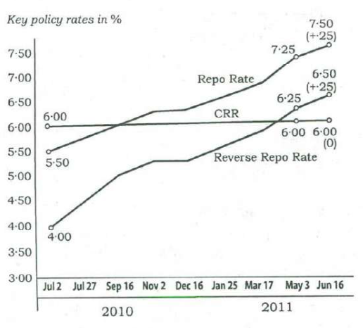
The graph given below indicates the changes in key policy rates made by the Central Bank several times in a year:

Rate (%)Jul 2, 2010May 3, 2011Jun 16, 2011
Repo Rate5·507·257·50 (+·25)
Reverse Repo Rate4·006·256·50 (+·25)
CRR6·006·006·00 (0)
Line graph of key policy rates from 2 July 2010 to 16 June 2011: the repo rate rises in steps from 5.50% to 7.50% and the reverse repo rate from 4.00% to 6.50%, while the CRR stays flat at 6.00%; the table lists the values labelled on the graph.
From UPSC's question paper.

Which one of the following can be the most likely reason for the Central Bank for such an action?

Answer & explanation

Answer: (d) Anti-inflationary stance

The central bank raised the repo and reverse repo rates again and again — by 2 and 2.5 percentage points in under a year — while keeping CRR unchanged. Repeated rate hikes make borrowing dearer and pull money out of the system, the standard response to high inflation.

  1. Repo rate: 5.50% → 7.50%; reverse repo: 4.00% → 6.50%; CRR steady at 6.00%.
  2. Higher policy rates raise banks' cost of funds and lending rates, slowing credit and money supply.
  3. That tightens liquidity — the opposite of (b).
  4. Attracting foreign investment or savings is not the purpose of a year of repeated hikes; cooling demand and prices is — an anti-inflationary stance.

Remember · Rising repo and reverse repo rates mean tight money to fight inflation; falling rates mean easing to support growth and liquidity.

Question and answer: UPSC's official GS Paper II (2018, Series A) — paper ↗ · answer key ↗. Explanation: Minimalist IAS, checked 1 Oct 2026 (how we verify). Permalink ·

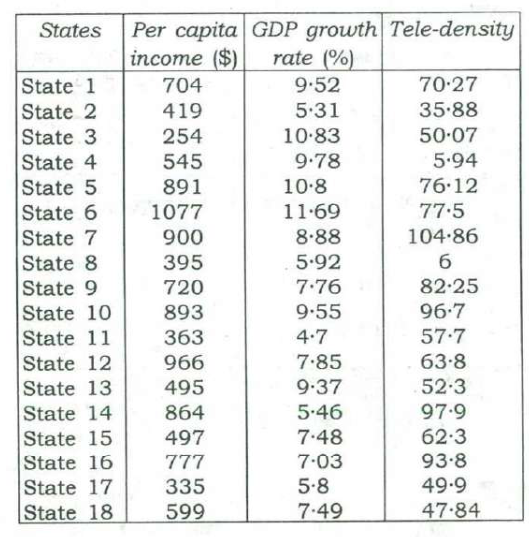
Directions for the following 2 (two) items: The following table gives the GDP growth rate and Tele-density data of different States of a country in a particular year. Study the table and answer the two items that follow.

With reference to the above table, which of the following is/are the most logical and rational inference/inferences that can be made?

  1. 1.Higher per capita income is generally associated with higher Tele-density.
  2. 2.Higher GDP growth rate always ensures higher per capita income.
  3. 3.Higher GDP growth rate does not necessarily ensure higher Tele-density.
StatesPer capita income ($)GDP growth rate (%)Tele-density
State 17049·5270·27
State 24195·3135·88
State 325410·8350·07
State 45459·785·94
State 589110·876·12
State 6107711·6977·5
State 79008·88104·86
State 83955·926
State 97207·7682·25
State 108939·5596·7
State 113634·757·7
State 129667·8563·8
State 134959·3752·3
State 148645·4697·9
State 154977·4862·3
State 167777·0393·8
State 173355·849·9
State 185997·4947·84
A table of 18 States giving per capita income ($), GDP growth rate (%) and tele-density.
From UPSC's question paper.

Select the correct answer using the code given below.

Answer & explanation

Answer: (c) 1 and 3

Sorted by income, the richer States mostly have high tele-density: the nine highest-income States average about 85, the nine lowest about 41. State 3, with the second-highest growth rate, has the lowest per capita income, which defeats 'always' in 2; State 4 grows at 9.78% with tele-density of only 5.94, confirming 3.

  1. Statement 1: the nine richest States (6, 12, 7, 10, 5, 14, 16, 9, 1) average tele-density of about 85; the nine poorest average about 41 — a general association.
  2. Statement 2: State 3 grows at 10.83% (second highest) but has the lowest per capita income, $254 — 'always' fails.
  3. Statement 3: State 4 grows at 9.78% with tele-density 5.94, while State 14 grows at 5.46% with 97.9 — high growth does not ensure high tele-density.
  • ✓ 1. Exceptions exist (State 3 at $254 has 50.07), but 'generally' allows them; income and tele-density clearly move together across the table.
  • ✗ 2. One counter-example is enough: State 3 has the second-highest growth and the lowest per capita income.
  • ✓ 3. State 4 (9.78% growth, 5.94 tele-density) shows high growth without high tele-density.

Remember · 'Generally' tolerates exceptions; 'always' falls to one counter-example. Scan the table for a single contradicting row.

Question and answer: UPSC's official GS Paper II (2018, Series A) — paper ↗ · answer key ↗. Explanation: Minimalist IAS, checked 1 Oct 2026 (how we verify). Permalink ·

Directions for the following 2 (two) items: The following table gives the GDP growth rate and Tele-density data of different States of a country in a particular year. Study the table and answer the two items that follow.

With reference to the above table, the following assumptions have been made:

  1. 1.Nowadays, prosperity of an already high performing State cannot be sustained without making further large investments in its telecom infrastructure.
  2. 2.Nowadays, a very high Tele-density is the most essential condition for promoting the business and economic growth in a State.
StatesPer capita income ($)GDP growth rate (%)Tele-density
State 17049·5270·27
State 24195·3135·88
State 325410·8350·07
State 45459·785·94
State 589110·876·12
State 6107711·6977·5
State 79008·88104·86
State 83955·926
State 97207·7682·25
State 108939·5596·7
State 113634·757·7
State 129667·8563·8
State 134959·3752·3
State 148645·4697·9
State 154977·4862·3
State 167777·0393·8
State 173355·849·9
State 185997·4947·84

Uses the same figure as Q74 ↑

Which of the above assumptions is/are valid?

Answer & explanation

Answer: (d) Neither 1 nor 2

The table records one year's figures; it cannot show what sustains prosperity or which condition growth needs most. Both statements make causal claims ('cannot be sustained without', 'most essential condition') that the data cannot bear — and the data even run against statement 2.

  • ✗ 1. A one-year snapshot says nothing about sustaining prosperity or the need for further telecom investment; the claim is a causal prediction beyond the table.
  • ✗ 2. The table shows high growth with very low tele-density (State 4: 9.78%, 5.94) and very high tele-density with modest growth (State 14: 5.46%, 97.9), so tele-density cannot be the most essential condition.

Remember · A single table shows associations, not causes; reject assumptions claiming 'cannot without' or 'most essential' from it.

Question and answer: UPSC's official GS Paper II (2018, Series A) — paper ↗ · answer key ↗. Explanation: Minimalist IAS, checked 1 Oct 2026 (how we verify). Permalink ·

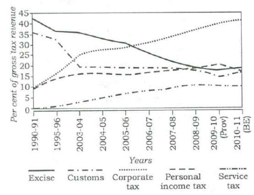
The following graph indicates the composition of our tax revenue for a period of two decades:

With reference to the above graph, which of the following is/are the most logical and rational inference/inferences that can be made?

  1. 1.During the given period, the revenue from Direct Taxes as percentage of gross tax revenue has increased while that of Indirect Taxes decreased.
  2. 2.The trend in the revenue from Excise Duty demonstrates that the growth of manufacturing sector has been negative during the given period.
Line graph, 1990-91 to 2010-11 (BE), of each tax's per cent share of gross tax revenue: excise falls from about 42 to about 19, customs from about 36 to about 17, corporate tax rises from about 9 to about 42, personal income tax from about 9 to about 18, and service tax from 0 to about 11.
From UPSC's question paper.

Select the correct answer using the code given below.

Answer & explanation

Answer: (a) 1 only

Corporate and personal income tax (direct taxes) together rise from about 19% to about 60% of gross tax revenue, while excise, customs and service tax (indirect) fall from about 78% to about 48% — statement 1. A falling share of excise says nothing about whether manufacturing shrank, so statement 2 does not follow.

  1. Direct taxes: corporate (about 9 → 42) + personal income tax (about 9 → 18) = about 19% → 60%.
  2. Indirect taxes: excise (42 → 19) + customs (36 → 17) + service tax (0 → 11) = about 78% → 48%.
  3. The graph gives shares of the total, not amounts collected.
  • ✓ 1. The direct-tax share roughly triples while the indirect-tax share falls by about 30 points.
  • ✗ 2. Excise's share can fall while its collections and manufacturing output grow, for example if direct taxes grow faster or duty rates are cut; a share graph cannot show negative growth.

Remember · A falling share is not a falling amount — percentage-composition graphs cannot show absolute decline.

Question and answer: UPSC's official GS Paper II (2018, Series A) — paper ↗ · answer key ↗. Explanation: Minimalist IAS, checked 1 Oct 2026 (how we verify). Permalink ·